Components
Components are the systematic building blocks of our design system that empower users to create consistency across their products.

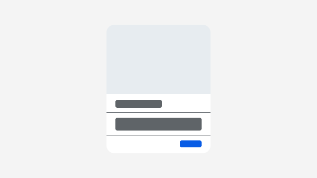
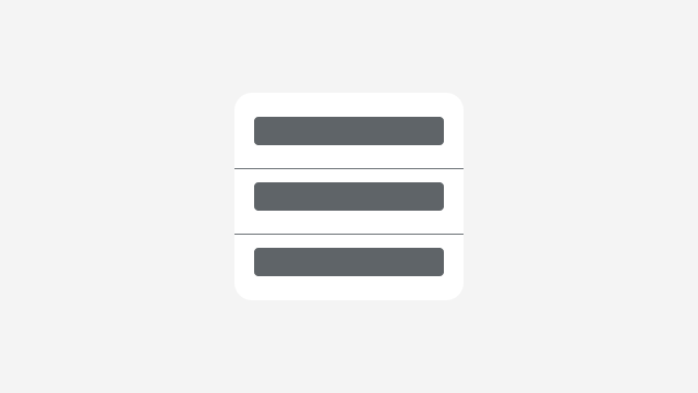
Cards are versatile content structures that group related concepts and tasks together as well as provide an entry point to more complex and detailed information.
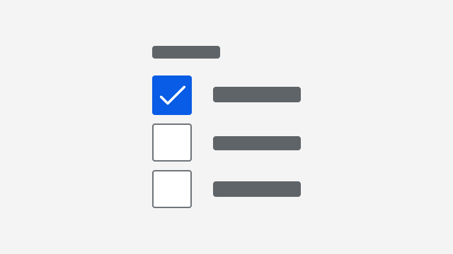
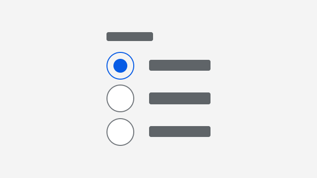
Checkbox groups display a related set of options where multiple options can be selected.
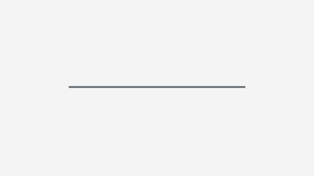
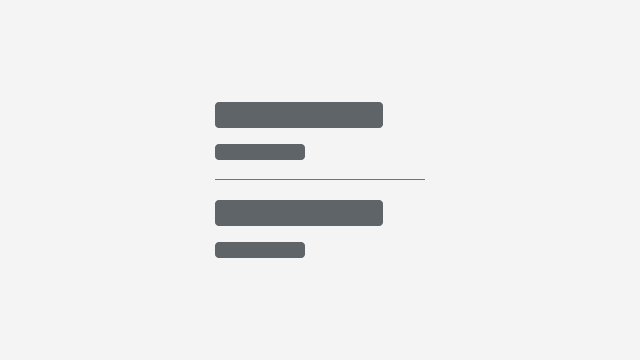
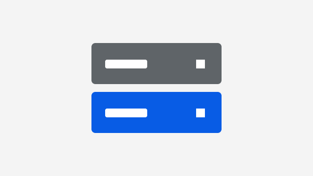
A divider creates visual hierarchy and rhythm within a layout by partitioning content into meaningful sections.
Icons are graphic representations of concepts and actions that help establish context and purpose for other user interface elements.

An email input is a single-line text field with behaviors to support email functionality.
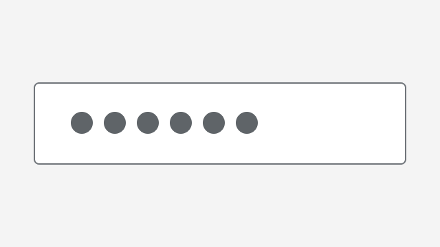
A password input is a single-line text field with iconography and behaviors to support password functionality.
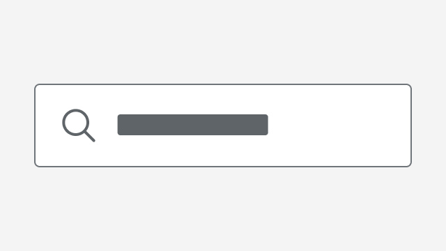
A search input is a single-line text field with iconography and behaviors to support search functionality.
A telephone input is a single-line text field with behaviors to support telephone functionality.
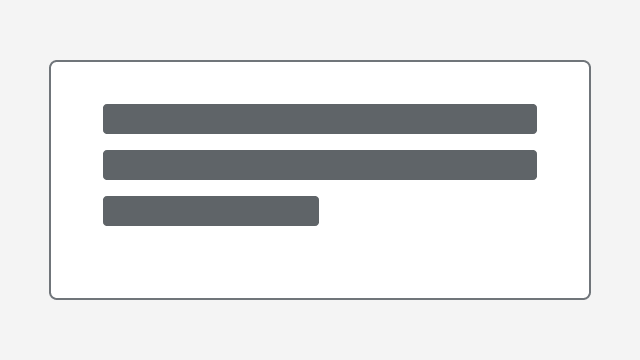
The input textarea component provides a multi-line text field that allows users to submit detailed, unstructured, free-form text.