Input - Search
A search input is a single-line text field with iconography and behaviors to support search functionality.
BetaInput replaces the search type of input from v1.
Code documentation
Anatomy
The search input component is made up of 13 elements.
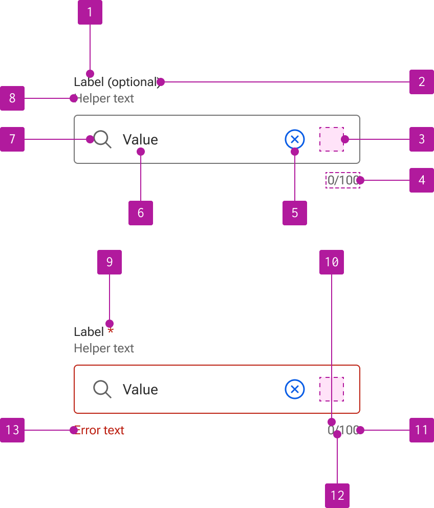
- Label
- Optional indicator
- Right slot
- Counter
- Clear button
- Value
- Search icon
- Helper text
- Required indicator
- Current value length
- Max value length
- Counter divider
- Error text
Variants
Input search extends the input component which allows for the use of its properties, events, slots, methods, and styles. Refer to the input documentation for detailed information on these features.
The following variants are unique features to input search.
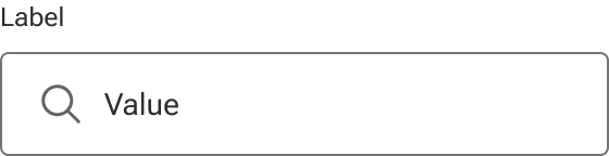
Search icon
An icon is included within the left slot to visually describe the input as a search input. A default icon is supplied, but can be overridden with a custom icon if required. When the slot is hidden, the input text expands to fill the available space.