Input - Number
A number input is a single-line text field with behaviors to support number functionality.
Code documentation
Anatomy
The number input component is made up of 14 elements.
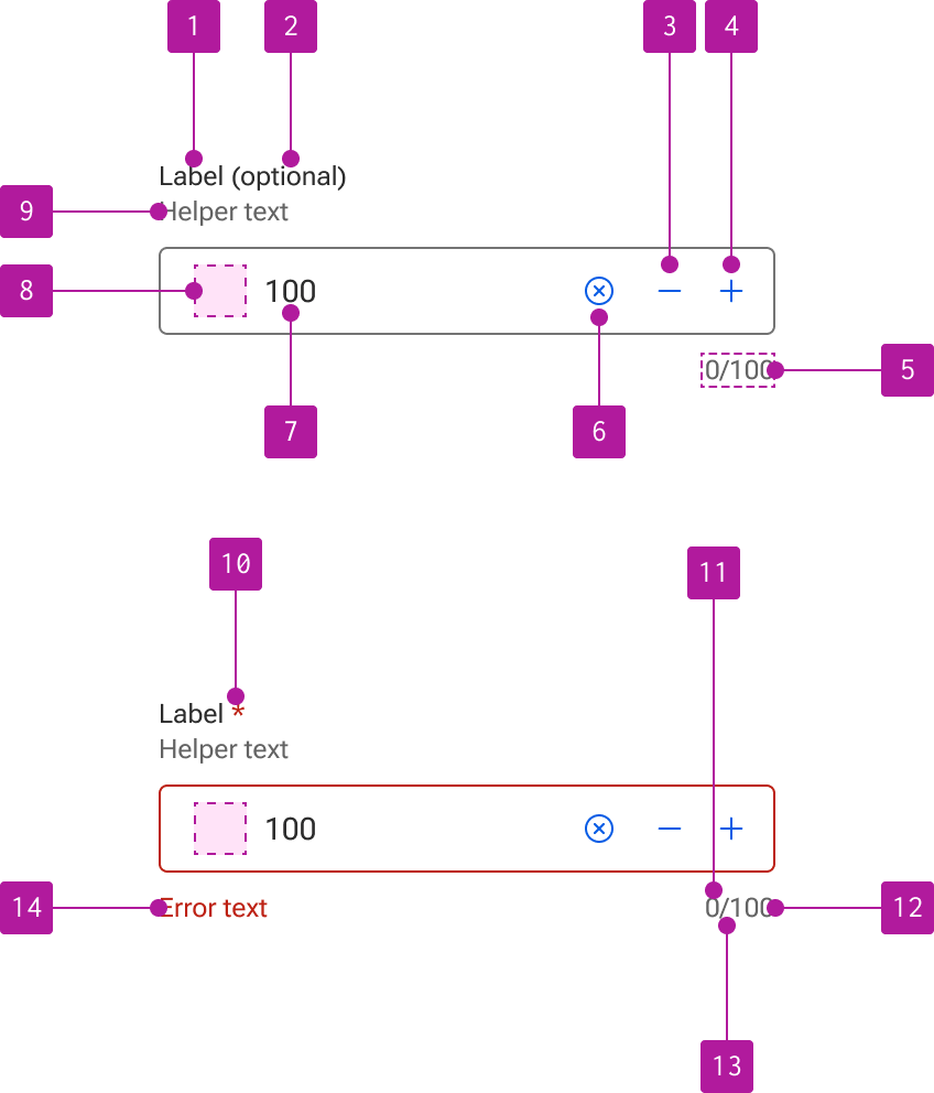
- Label
- Optional indicator
- Increment stepper
- Decrement stepper
- Counter
- Clear button
- Value
- Left slot
- Helper text
- Required indicator
- Current value length
- Max value length
- Counter divider
- Error text
Variants
Number input extends the input component which allows for the use of its properties, events, slots, methods, and styles. Refer to the input documentation for detailed information on these features.
The following variants are unique features to number input.
Step
The number input provides an increment and decrement button within the right slot. These buttons can be respectively used to increase and decrease the value. By default, the value steps in increments of 1. However, this can be adjusted by the user to be any numeric value including decimals.
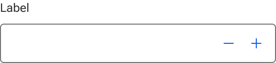
Alternate icons can be slotted into the either stepper button if thematic customizations are required.